
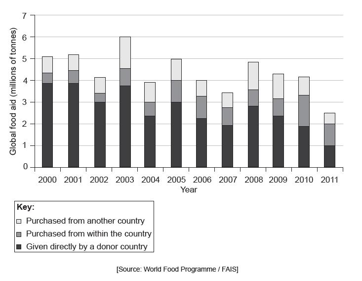
The graph shows the amount of global food aid in millions of tonnes, from 2000 to 2011.

Explain two possible disadvantages of food aid for a community that is currently experiencing food shortages.

“Prevention should always be prioritized over treatment.” Discuss this statement, with reference to specific diseases and communities.

Describe the trends in food aid between 2000 and 2011.

To what extent have recent changes in farming increased the production and availability of food in low-income nations?

State two diseases associated with poverty.

Describe the distribution of diseases associated with poverty.

Explain two types of diffusion in relation to the spread of diseases.

Outline one way in which the well-being of a community can be affected by persistent hunger.

The graph shows the mortality rates for children under the age of five for world regions between 1990 and 2015.
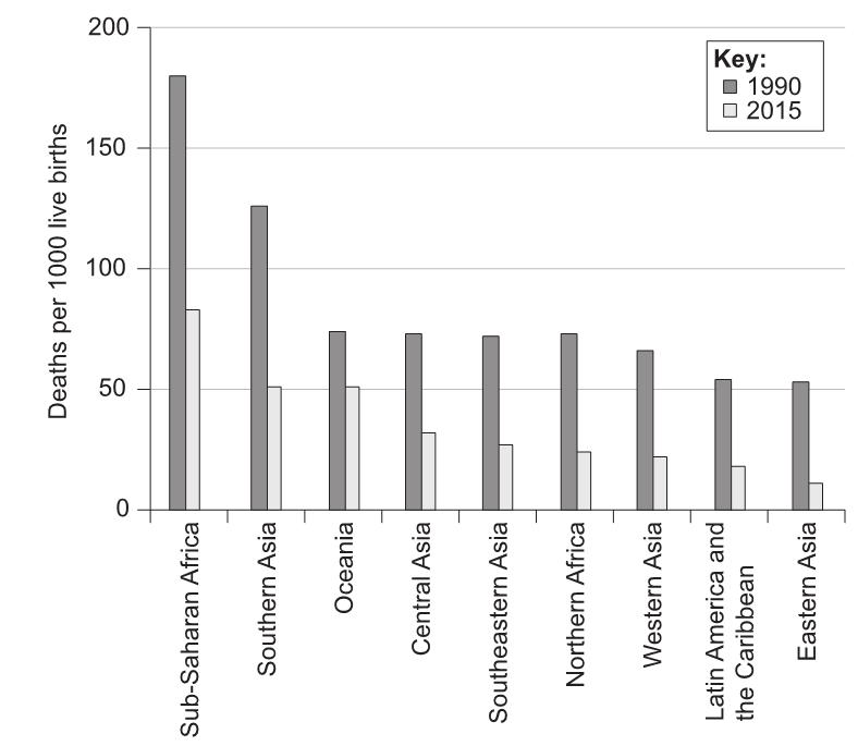

Describe the changes in Sub-Saharan Africa between 1990 and 2015.

Identify the region with the greatest relative change in mortality rate between 1990 and 2015.

Outline why HALE is a better indicator of a nation’s health than child mortality.

Explain how the application of two named barriers to limit the spread of disease has reduced child mortality rates.

Evaluate the relative importance of fair trade and food aid in overcoming food shortages in low-income countries.

The diagrams show the average daily consumption of calories per person.
* Rich and Poor countries according to FAO classification

Outline two differences between calorie consumption in rich countries and poor countries in 2000.

The graph shows the food miles for fruit and vegetables supplied to institutions in the state of Iowa, USA.
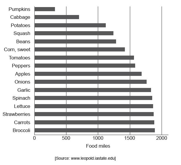

(i) Define the term food miles.
(ii) State the fruit or vegetable that ranks sixth in terms of the highest number of food miles.
(iii) Estimate the average (mean) food miles for the fruit and vegetables shown in the graph above.

Suggest one advantage and two disadvantages of using food miles as an indicator of the environmental impacts associated with food production.

To what extent are food availability, malnutrition and diseases of poverty connected with one another?

The table below shows the prevalence of obesity and undernourishment in different world regions in 2022. The values represent the percentage of the population affected in each region.
| Region | Obesity (%) | Undernourishment (%) |
|---|---|---|
| North America | 36 | 3 |
| Sub-Saharan Africa | 8 | 22 |
| South Asia | 5 | 16 |
| Europe | 23 | 2 |
Using the information provided in the table, answer the following questions.

Describe the prevalence of obesity and undernourishment in the regions shown in the table.

Calculate the difference between the percentage of obesity and undernourishment in North America. Express your answer as a percentage.

Explain two possible reasons for the high percentage of undernourishment in Sub-Saharan Africa.

Discuss the potential health implications of the high prevalence of obesity in North America.

Evaluate the effectiveness of one intervention aimed at reducing undernourishment in South Asia.

The map shows the life expectancy at birth for countries other than those in the Americas.
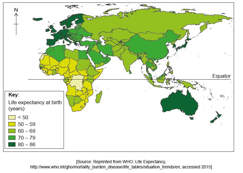

Describe the pattern of life expectancy shown on the map.

Explain three indicators, other than life expectancy, which can be used to measure the health of the population in a country.

“Food miles are an excellent indicator of the environmental impact of agriculture.” Discuss this statement.
